Guiding the Conversation
Redefining Converse’s Brand Identity
Converse is more than a brand—it’s a cultural icon. But as the company evolved, so did the need for a brand identity that reflected its new purpose, position, and vision. Enter the Star Chevron, a symbol rooted in Converse’s rich history yet designed to propel the brand forward.
Originally introduced in 1975, the Star Chevron embodies a spirit of motion and progress. It’s not just a logo; it’s a mindset—a representation of Converse’s dominance in sports, street style, and authentic self-expression. Paired with a bold, reimagined wordmark that nods to the brand’s heritage, the new identity system is a testament to Converse’s evolution.
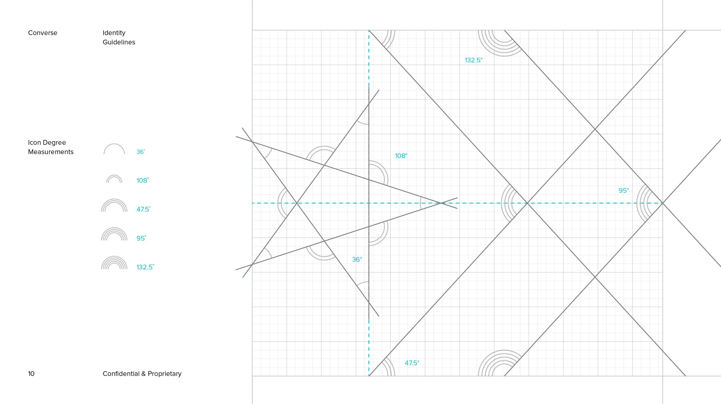
This case study explores how Converse’s Brand Identity Guidelines were crafted to unify the brand’s voice, visuals, and messaging. From logo usage to typography, every detail was designed to ensure consistency and confidence in how Converse shows up in the world. Because when it comes to building a brand that resonates, every element matters.

